Safety should be obvious
MRI Machines Save Lives
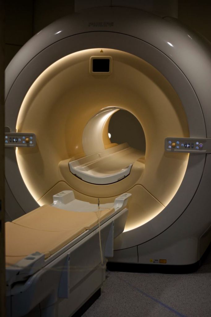
Magnetic resonance imaging (MRI) has contributed significantly to clinical diagnoses since the 1970s. It uses magnetic fields and radio waves to capture images within our bodies, safely and non-invasively.
To do this, most clinical MRI machines use superconducting magnets with magnetic strengths of around 0.5 to 3 Teslas. 1 Tesla equates to 10,000 gauss. The Earth’s gravitational pull is ~0.5 gauss, while a fridge magnet has 10 gauss.
The Force Is Strong With This One
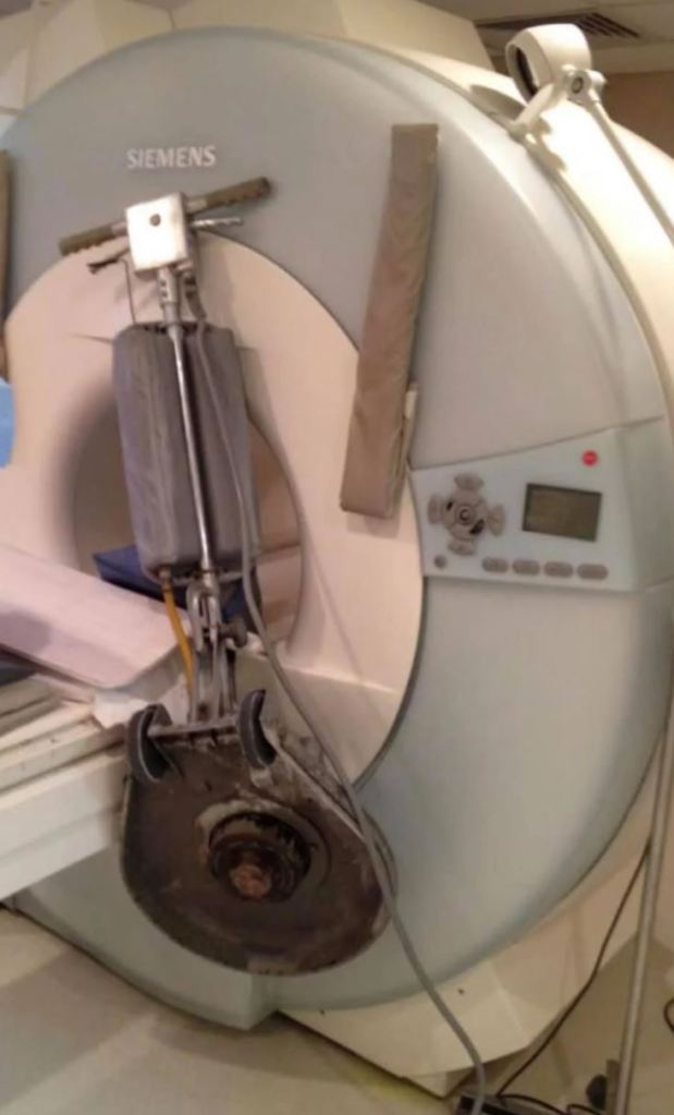
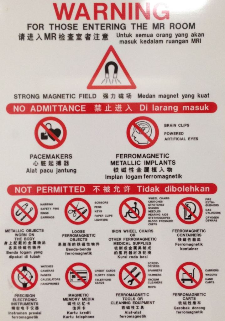
What harm can a huge, high-powered magnet possibly do? Apparently quite a lot! As acknowledged by the US Food & Drug Administration (FDA), the strong magnetic field will send any magnetic objects flying, ranging from tiny paperclips to gas cylinders weighing more than 60kg (130lbs). It can also affect metal body implants and mess with sensitive instruments like pacemakers and drug infusion pumps.
People should know about these hazards, and well-meaning posters have been made.
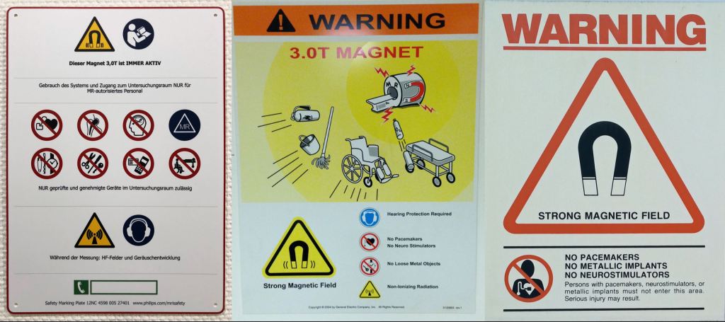
There should be a better way to visualize all these hazards.
A Human Factors Exercise
Human factors is the science of improving work performance and optimizing the efficiency between humans and systems in the workplace. As human factors practitioners, we approached the problem by first understanding how people normally interacted with and used these MRI posters.
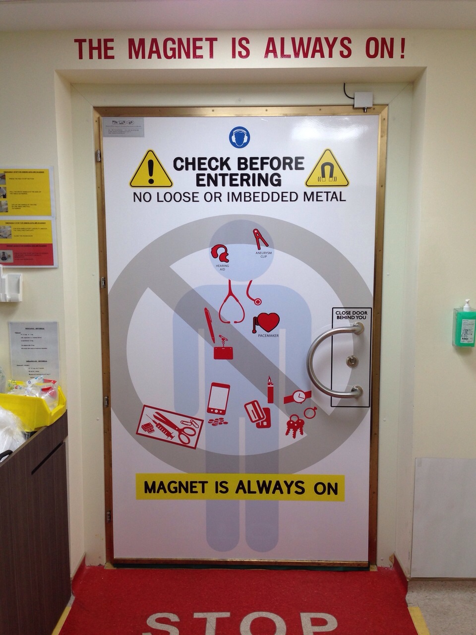
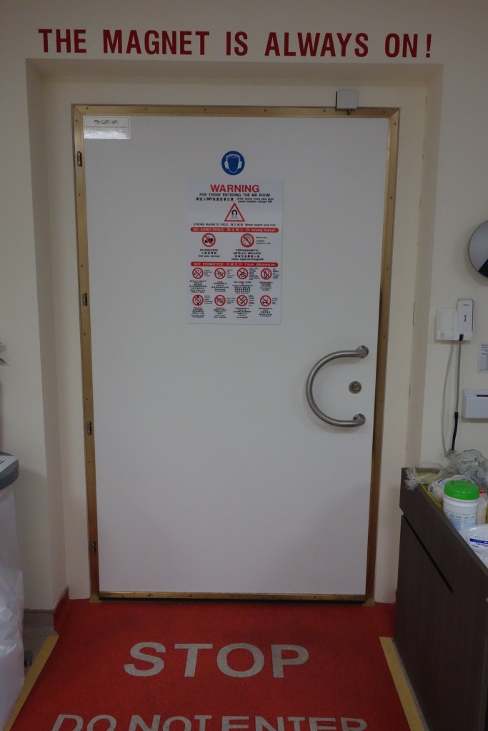
Posters were usually hung on doors prior to entry into MRI rooms. These posters may be used as visual guides for safety checks prior to entering, or as a final reminder of what not to bring beyond this point.
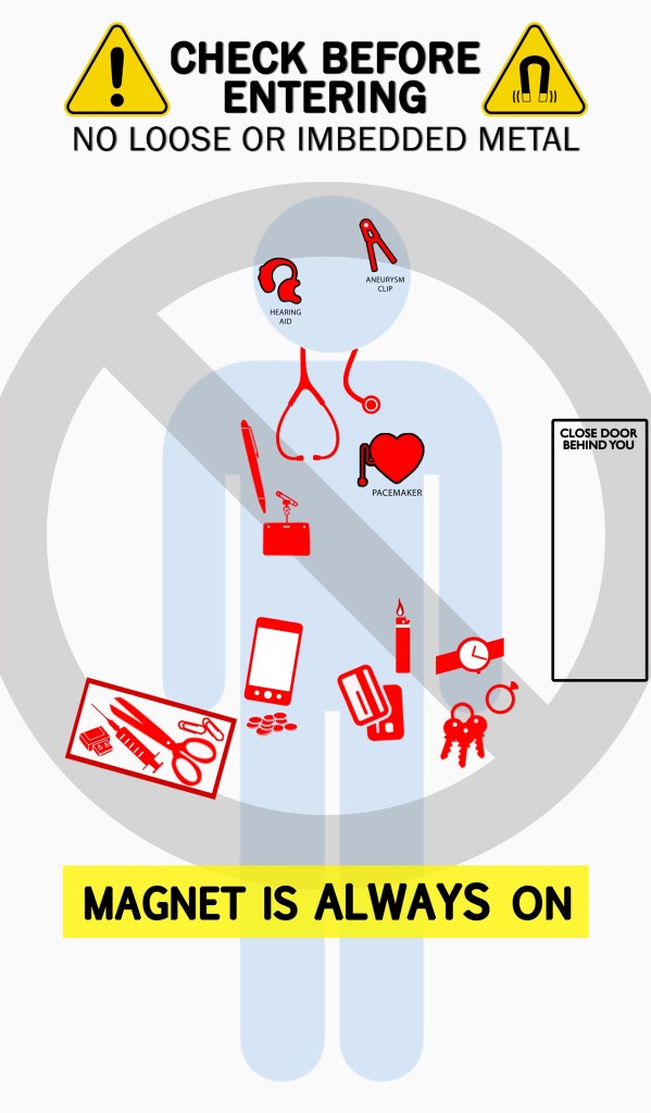
Through improving the visual management and information design of the MRI poster, we can make it less effortful to understand what this static poster is trying to communicate.
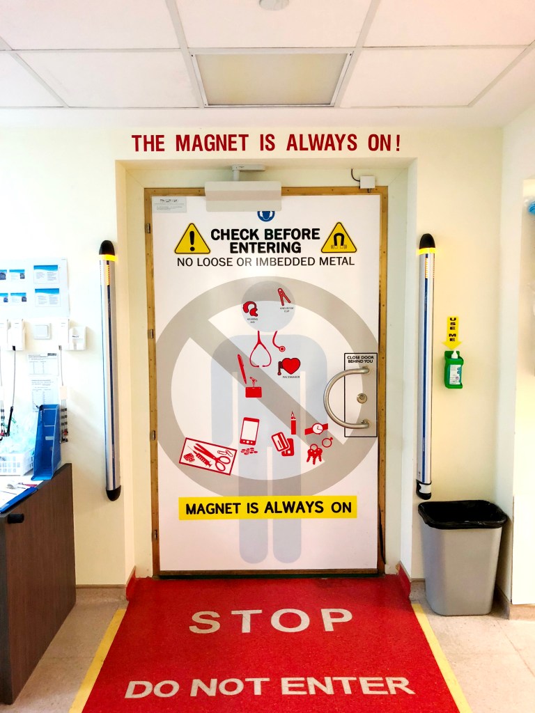
We maximized the size of the poster by using the entire shielded door’s face as canvas. This afforded us plenty of space for large images, and made reading the poster easy even from a distance.
Despite the increased canvas size, all the different warnings and hazards were strategically consolidated to provide a concise message. Most MRI hazards were common, unsuspecting objects found on our bodies, and they were highlighted in red.
These objects were laid out over a human silhouette, providing additional context of what these items are, and serving as spatial references of where you might want to check.


Obviously there were a lot more going on behind the development of the design, but we figured you’re here for the poster and not for the story (but if you are, we wrote one for RAD Magazine).
We hope you’d think this is a good idea too. Feel free to adopt a similar poster design to promote MRI safety at your workspace. We leave this idea here as open source. 🙂
This page is brought to you by

Dr. SQ Yin
Assistant Director, Human Factors & Systems Design
KK Women’s & Children’s Hospital, Singapore
Adj. Asst. Professor
Duke-NUS Medical School
SQ’s LinkedIn

Mr Johnathan Siew
Senior Specialist. Office of Improvement Science
Changi General Hospital, Singapore
Johnathan’s LinkedIn

Copyright © 2021 MRIDoorPoster.com. All rights reserved
